No Hierarchy: A Messy Start
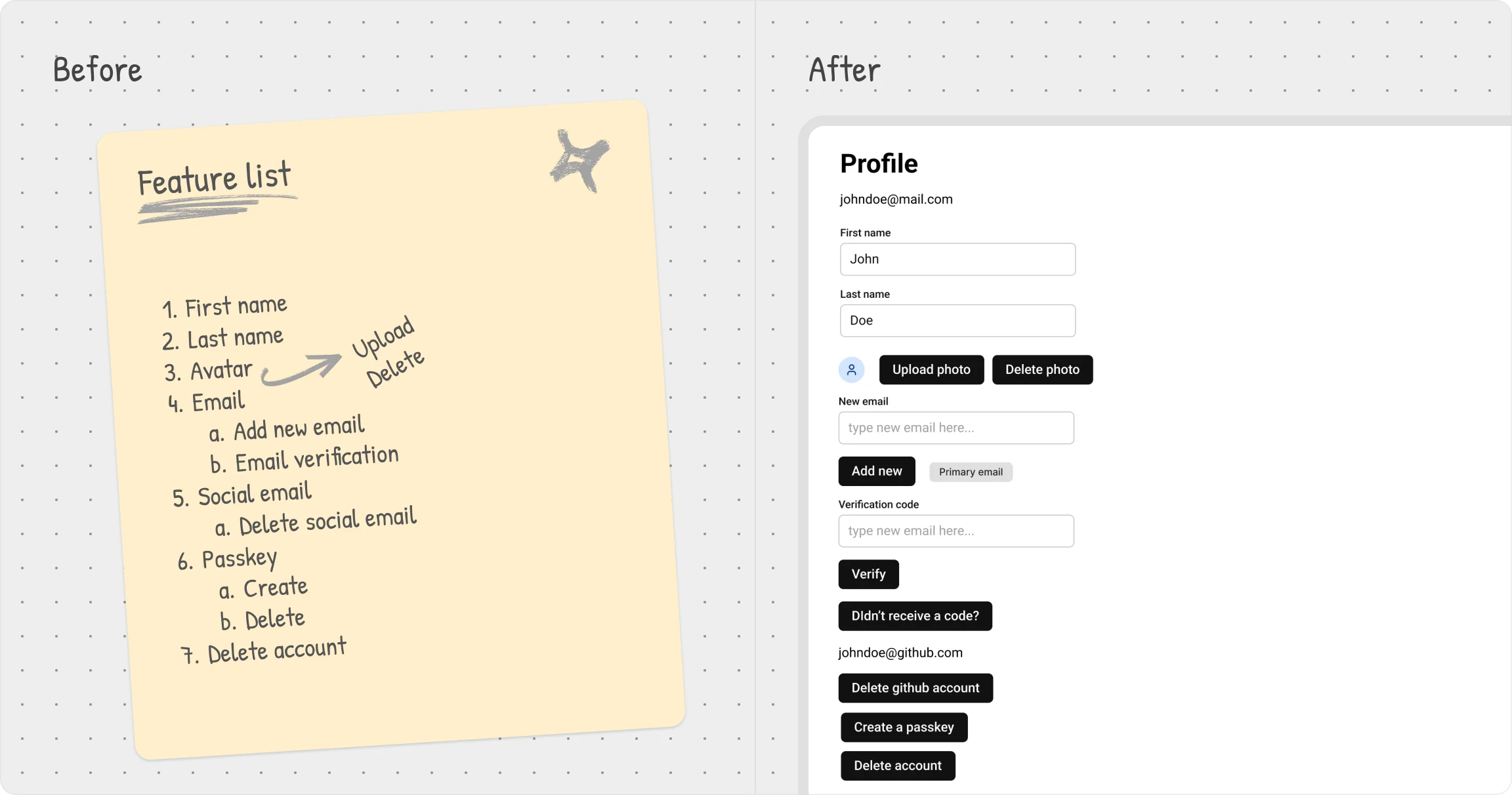
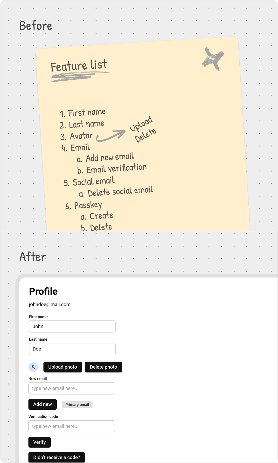
The easiest way to understand visual hierarchy is to see what happens when it's missing.
When every element screams for attention, nothing stands out. Users don't know where to look first, and that hesitation leads to frustration. Instead of smoothly navigating the interface, they have to work to make sense of it.
User settings example
Here's what that looks like in action — a settings page where everything has equal weight.
No clear focal point, no guidance on what's most important.
It's a baseline example
of what happens when hierarchy is ignored. From here, we'll refine the design step by step.
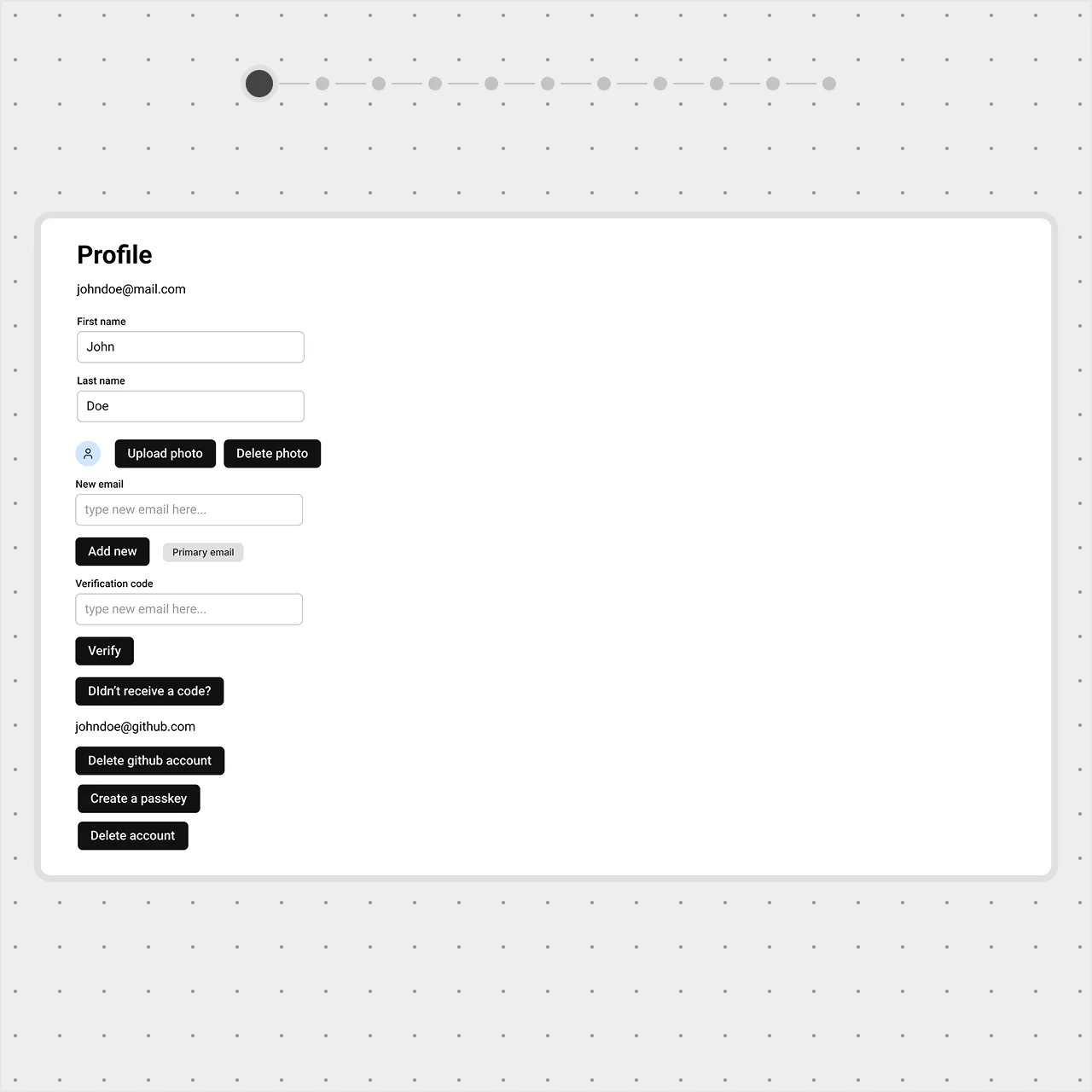 Features and components are randomly placed on the page.