Establishing a Clear Focus
Learn how to guide users to the most important elements first, enhancing clarity and improving their overall experience.
A good design tells users exactly where to look first. If everything demands attention, nothing actually stands out.
The key is to identify the most important elements—the ones that help users achieve the page’s main goal—and make sure they stand out. Everything else should take a backseat. Trying to highlight too many things at once only leads to visual noise.
There are several ways to control an element’s visual weight, but not every method works in every situation:
- Size – Users notice larger elements more easily;
- Color – Bright colors typically attract more attention than muted ones;
- Contrast – Dramatically contrasted colors are more eye-catching;
- Alignment – Out-of-alignment elements stand out over aligned ones;
- Repetition – Repeating styles can suggest content is related;
- Proximity – Closely placed elements seem related;
- Whitespace – More space around elements draws the eye towards them;
- Texture and Style – Richer textures stand out over flat ones.
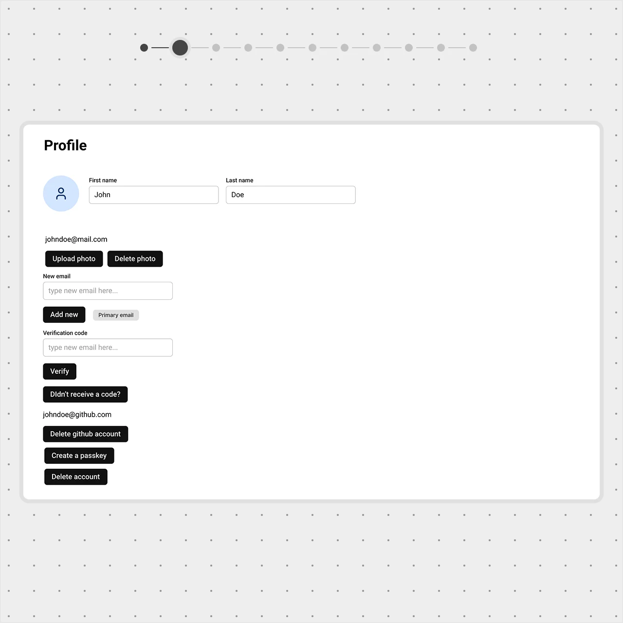
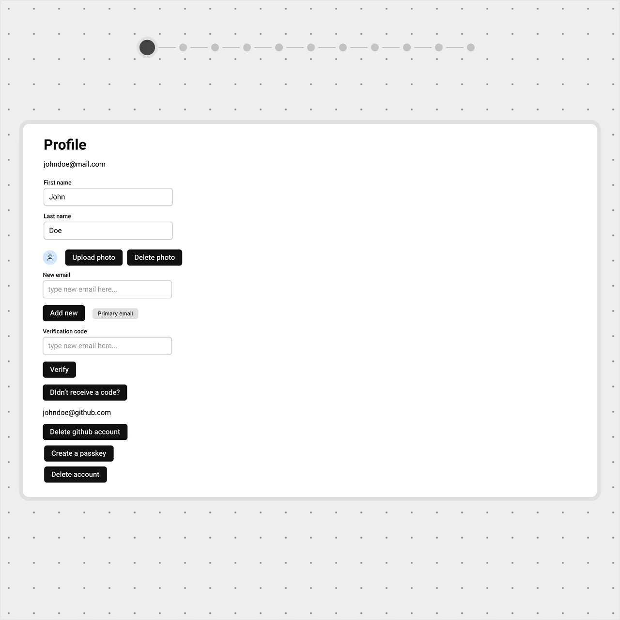
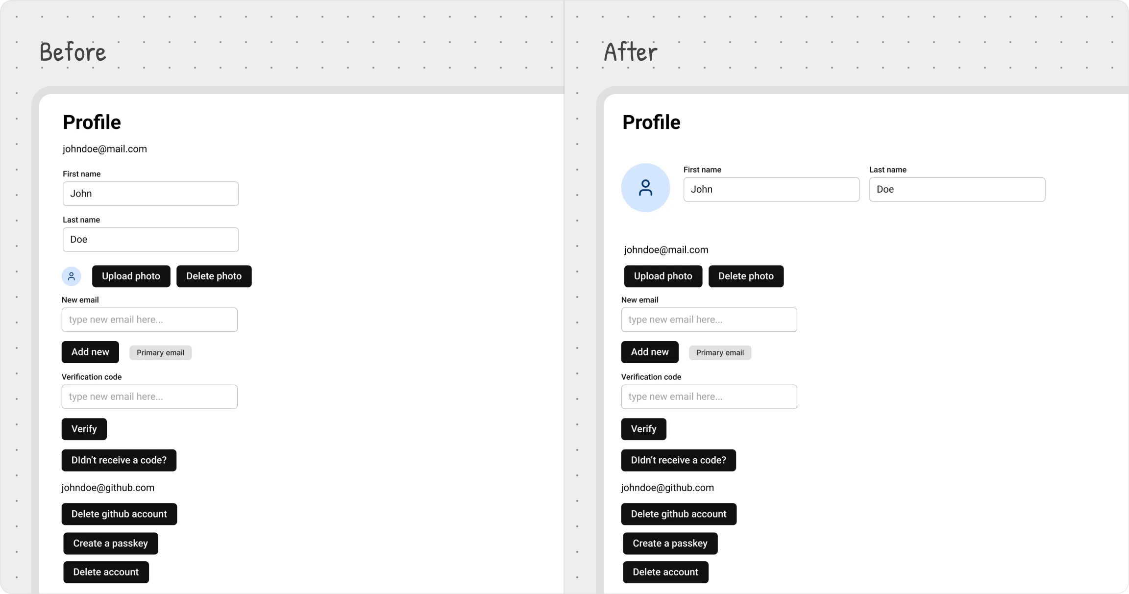
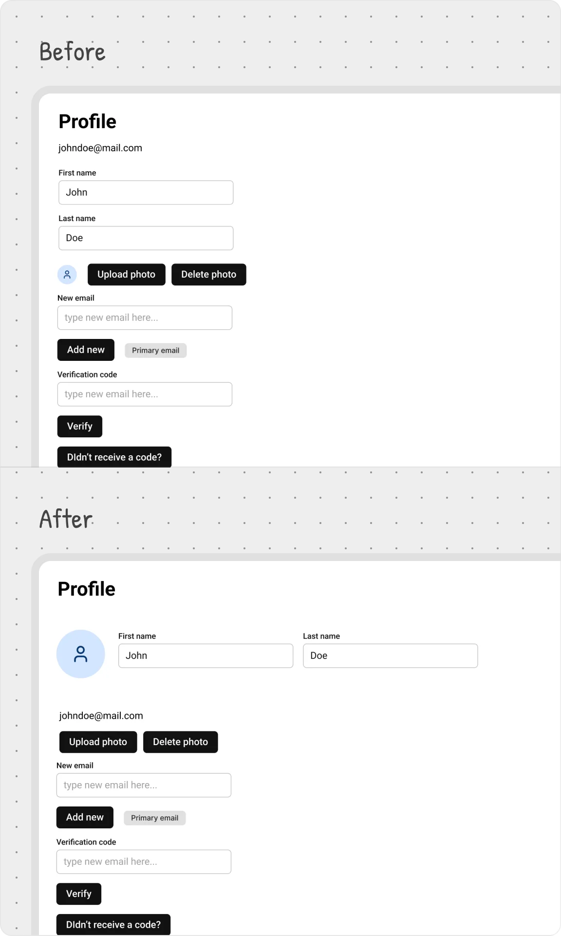
User settings example
On a profile page, the most important details are the avatar and name. Placing them at the top follows common design patterns — users expect this from other platforms, thanks to Jakob’s Law.
Imagine if the first thing users saw was their password instead. That wouldn’t give them the immediate context that a name and avatar provide. Personal details should feel central and be easy to update.
To emphasize these elements, we made a few key adjustments:
- Moved the avatar, first name, and last name to the top;
- Increased the avatar size for better visibility;
- Arranged them side by side to reinforce their connection.
These small changes create a clear focal point, making it obvious what matters most on the page.