Emphasizing by De-emphasizing
Learn how to de-emphasize secondary and tertiary elements to allow primary elements to stand out while keeping the interface balanced, intuitive and clean.
Good visual hierarchy isn’t just about making key elements stand out—it’s also about making everything else fade into the background. A cluttered UI happens when secondary elements fight for attention, making the page feel noisy and unbalanced.
The trick? De-emphasize supporting elements so primary ones naturally take center stage.
Visual hierarchy is relative—secondary elements should always feel less prominent than primary ones. If everything is bold, nothing actually stands out.
User settings example
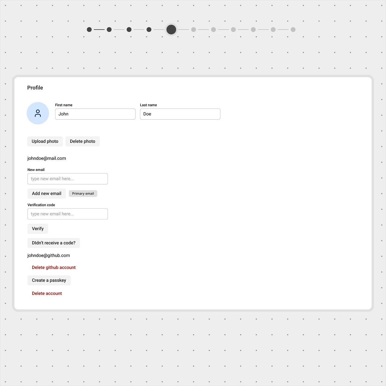
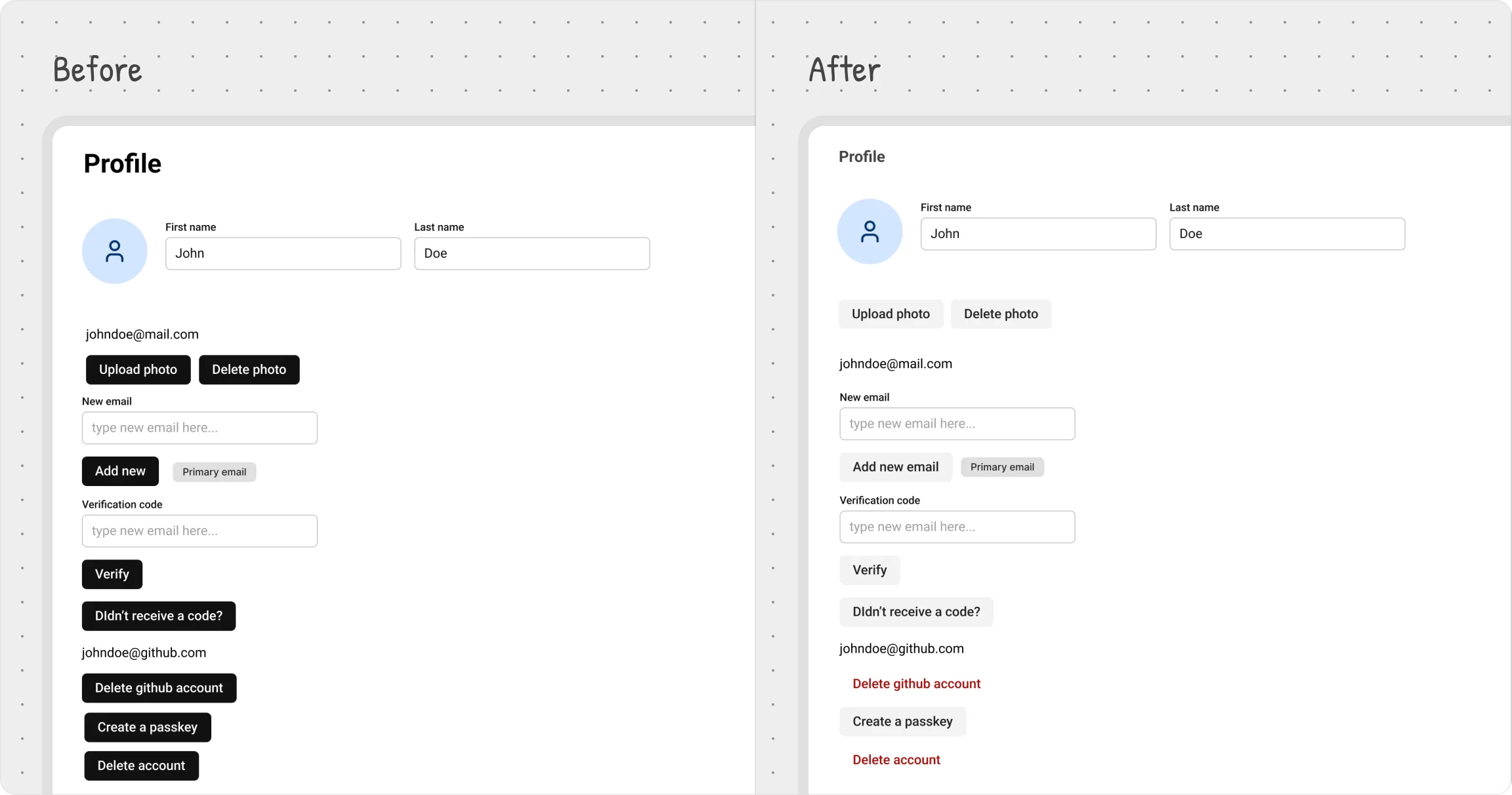
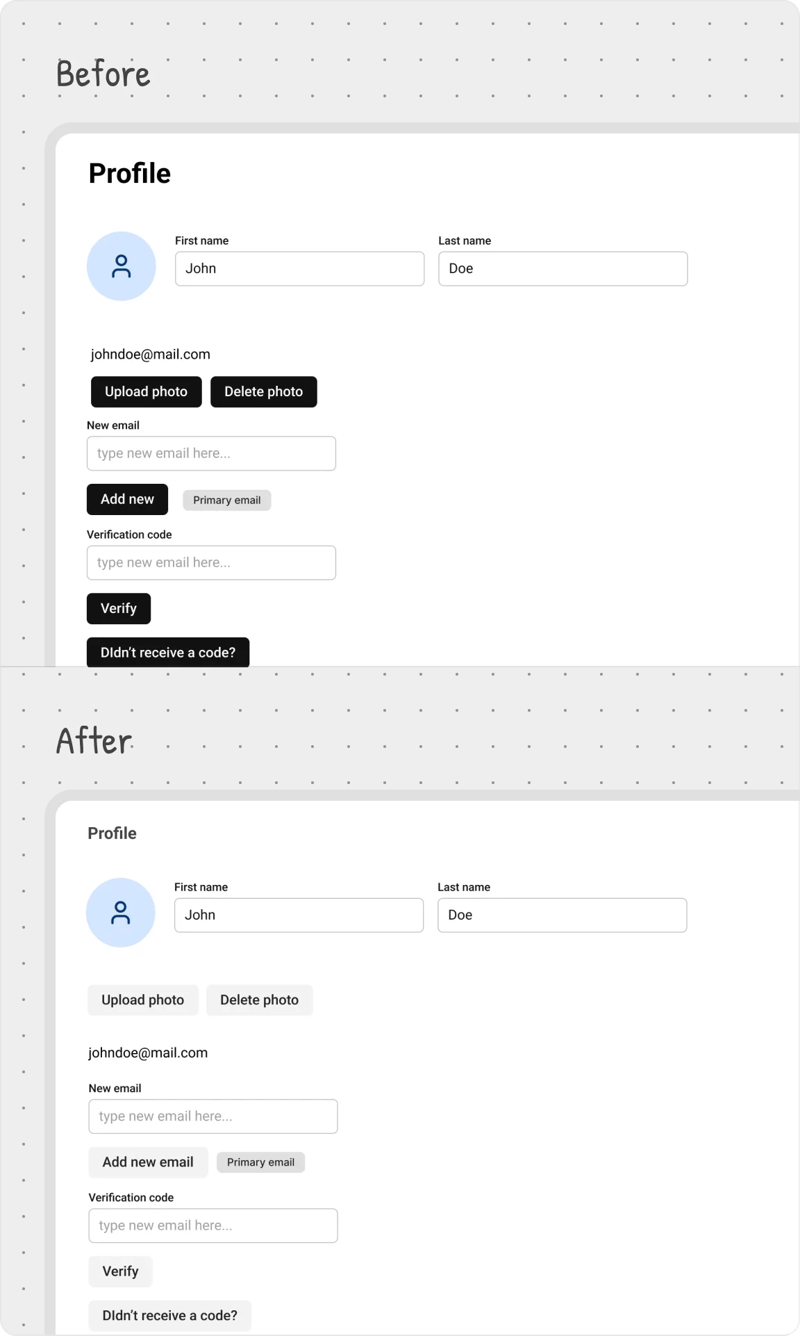
Titles provide context, but they don’t need to dominate.
We reduced the title size from H3 to h5 and adjusted the color to a lighter gray. This keeps it readable without competing with more important content.


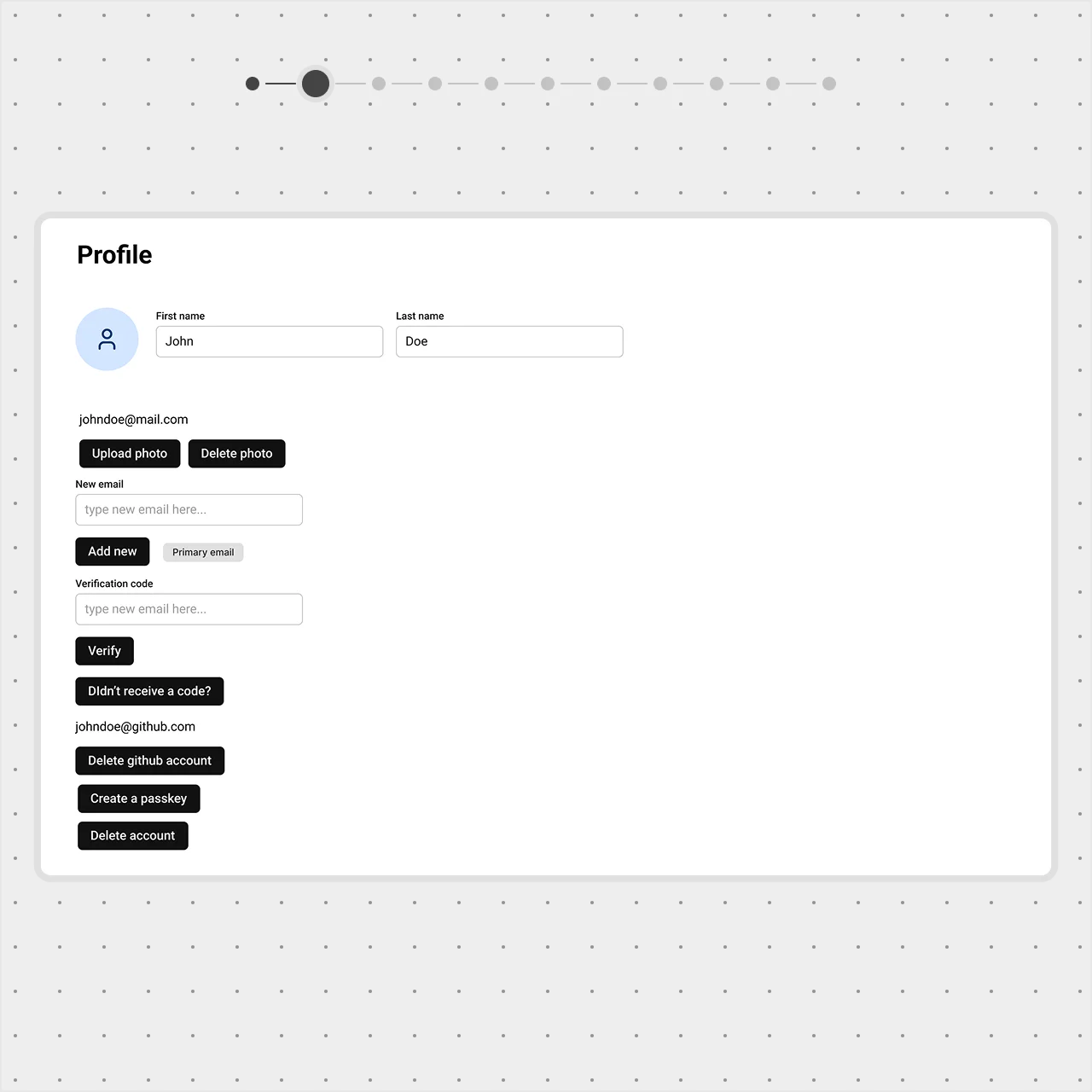
Too many actions create visual noise.
Options like Upload Photo, Delete Photo, and Add New were all demanding attention.
We switched their button style from Filled to Tonal, making them visually secondary while still discoverable.
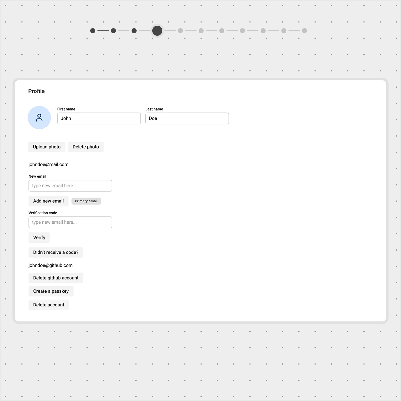
Destructive actions should be noticeable — but not overwhelming.
The ‘Delete profile’ and ‘Delete github account’ button need to stand out as a dangerous action, but it shouldn't dominate the page.
Instead of using an aggressive red, we applied a soft-error style, keeping it visible yet balanced while maintaining accessibility.
By controlling the visual weight of secondary and tertiary elements, you create a cleaner, more intuitive UI where the right things get noticed first.