Grouping for Clarity
Learn how to group related elements together and uses spacing to create clear distinctions, making the interface easier to navigate and understand.
A well-structured UI isn’t just about what’s on the screen—it’s about how elements relate to each other. Grouping helps users quickly understand which items belong together, making navigation smoother and reducing cognitive load.
When elements are scattered randomly, users struggle to make sense of the layout. But when related elements are visually connected, the structure feels natural and intuitive.
Tools for grouping elements:
- Proximity – Items placed close together are perceived as related;
- Similarity – Shared colors, shapes, sizes, or styles create visual connections;
- Framing – Borders, lines, or background blocks define groups;
- Alignment – Elements aligned on a common axis feel unified;
- Common Background – Placing items in the same container reinforces relationships;
- Whitespace – Strategic spacing separates groups and improves readability;
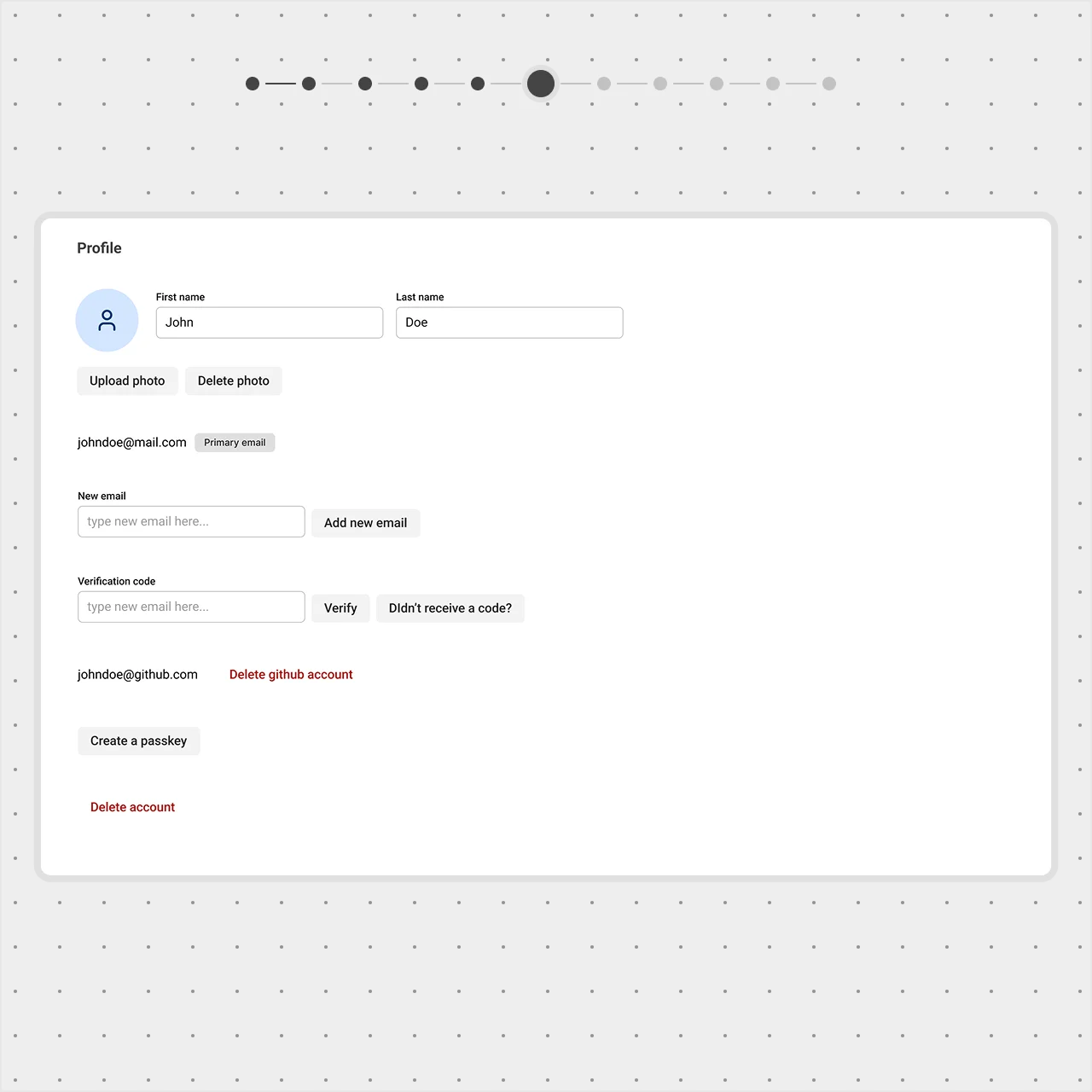
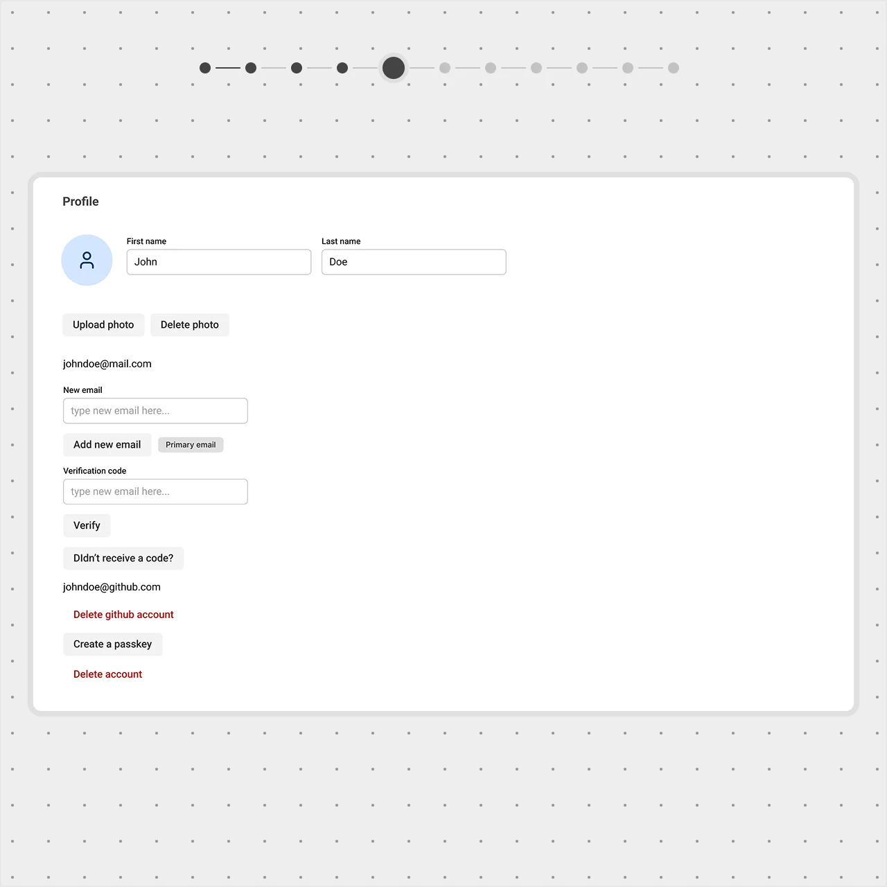
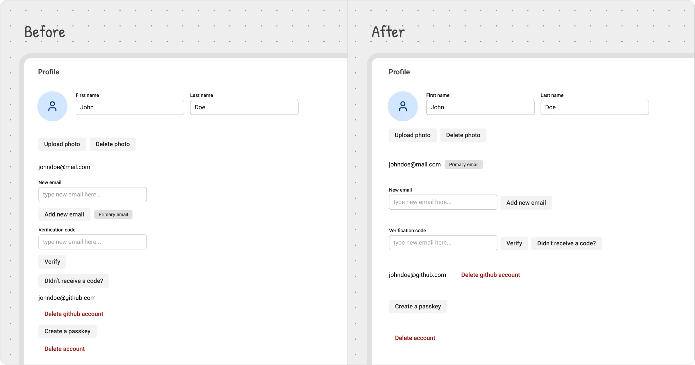
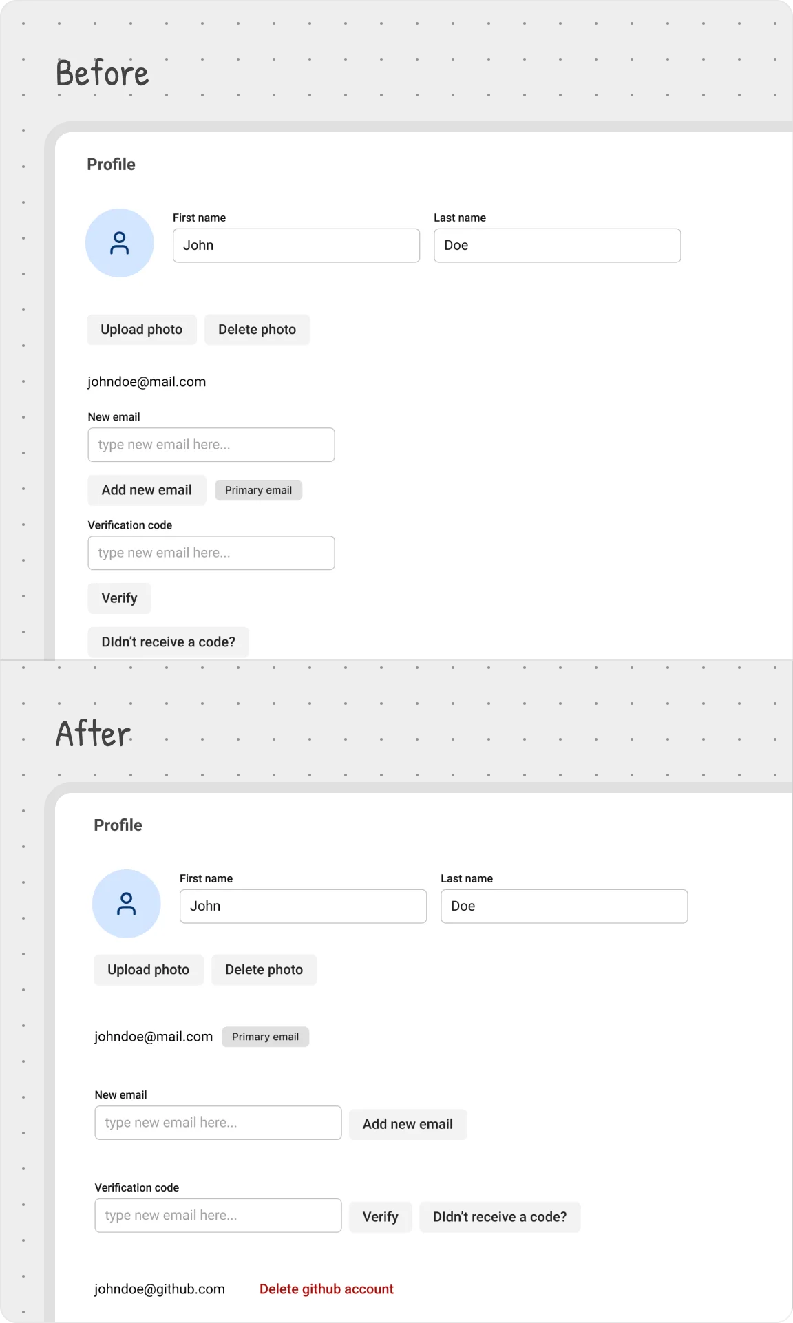
User settings example
Some elements naturally belong together—for example, the ‘New Email’ input and the Add New Email button. These should be visually grouped to create a clear relationship.
To achieve this, we:
- Placed them closer together to strengthen their connection;
- Aligned the button inline with the input field for a cleaner, more intuitive layout;
- Ensured the spacing between these elements is smaller than the distance to unrelated elements above and below;
This same principle was applied across the page, ensuring every section feels structured and easy to navigate.