Progressive Disclosure

Learn how to reveal information step-by-step, keeping the interface uncluttered and ensuring users focus on what’s relevant at each moment.

Visual Hierarchy

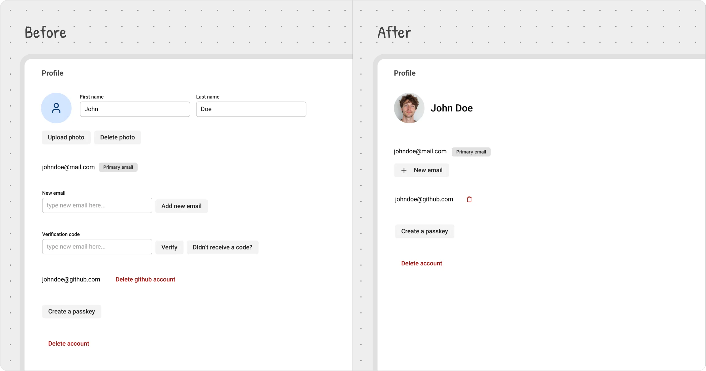
Users want flexibility, but they also want simplicity. If everything is visible at once, the interface feels cluttered and overwhelming. That’s where progressive disclosure comes in—only show what’s essential upfront, and reveal extra details when they’re actually needed.

This keeps the UI clean while ensuring advanced options remain accessible without adding cognitive load.

User settings example

To avoid overwhelming users with too much information at once, we applied progressive disclosure by selectively revealing interface elements at the right moments:

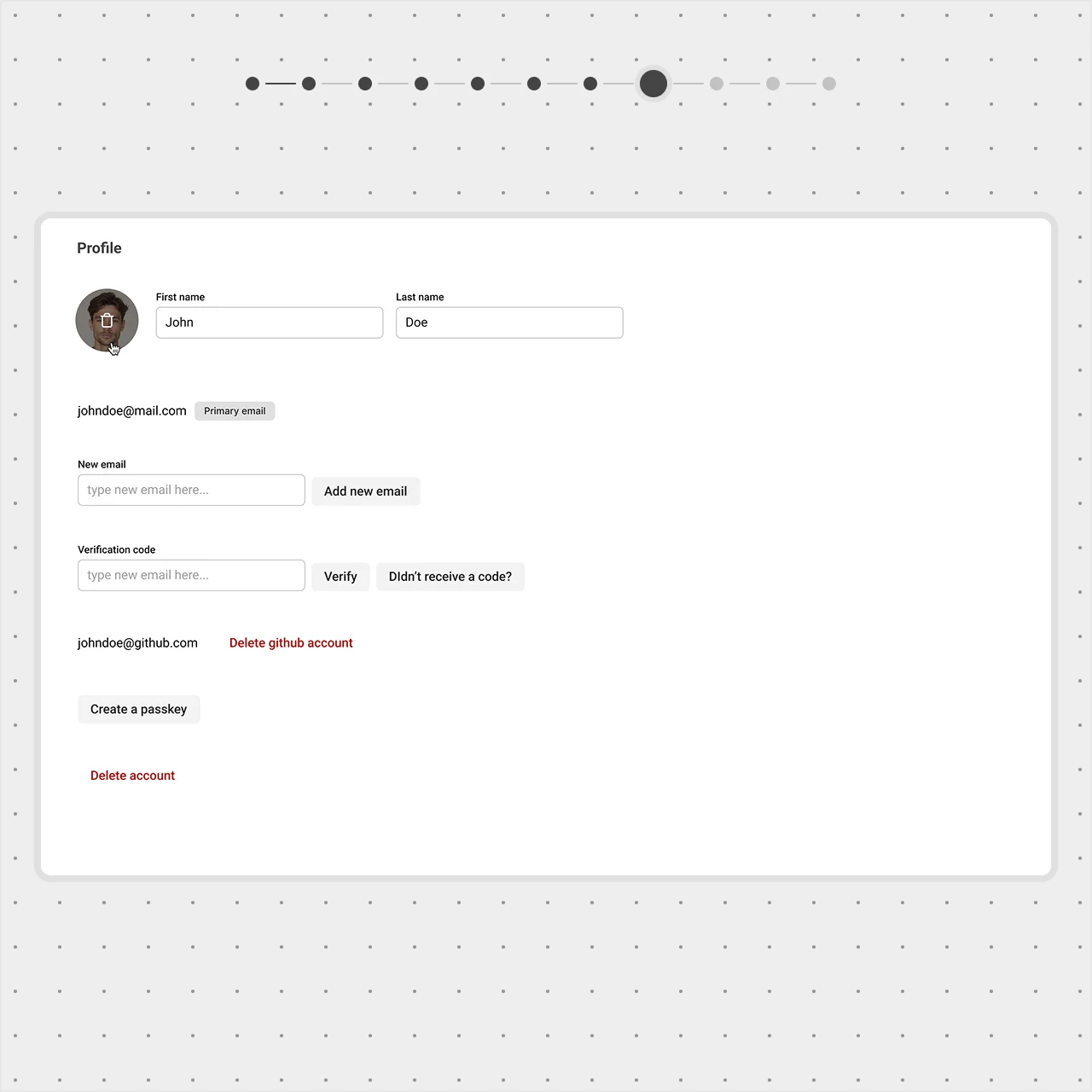
Hiding secondary actions until needed

Instead of always displaying the Upload Photo option, we show it as an icon button on hover over the avatar.

After label Before label A profile page with an avatar. The 'After' view shows an Upload Photo icon button appearing on hover over the avatar, simplifying the layout compared to the visible button in the 'Before' view.
A profile page with buttons and input fields. The 'After' view aligns buttons like Add New Email with the input field, reducing spacing for a cleaner layout compared to the 'Before' view.
The Upload Photo action was tucked behind an icon that appears on avatar hover.

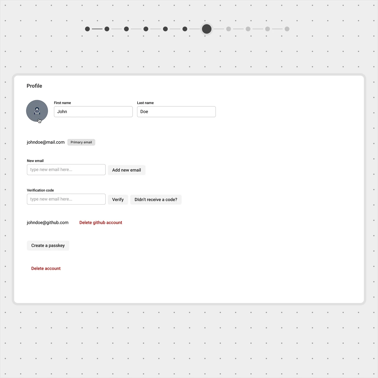
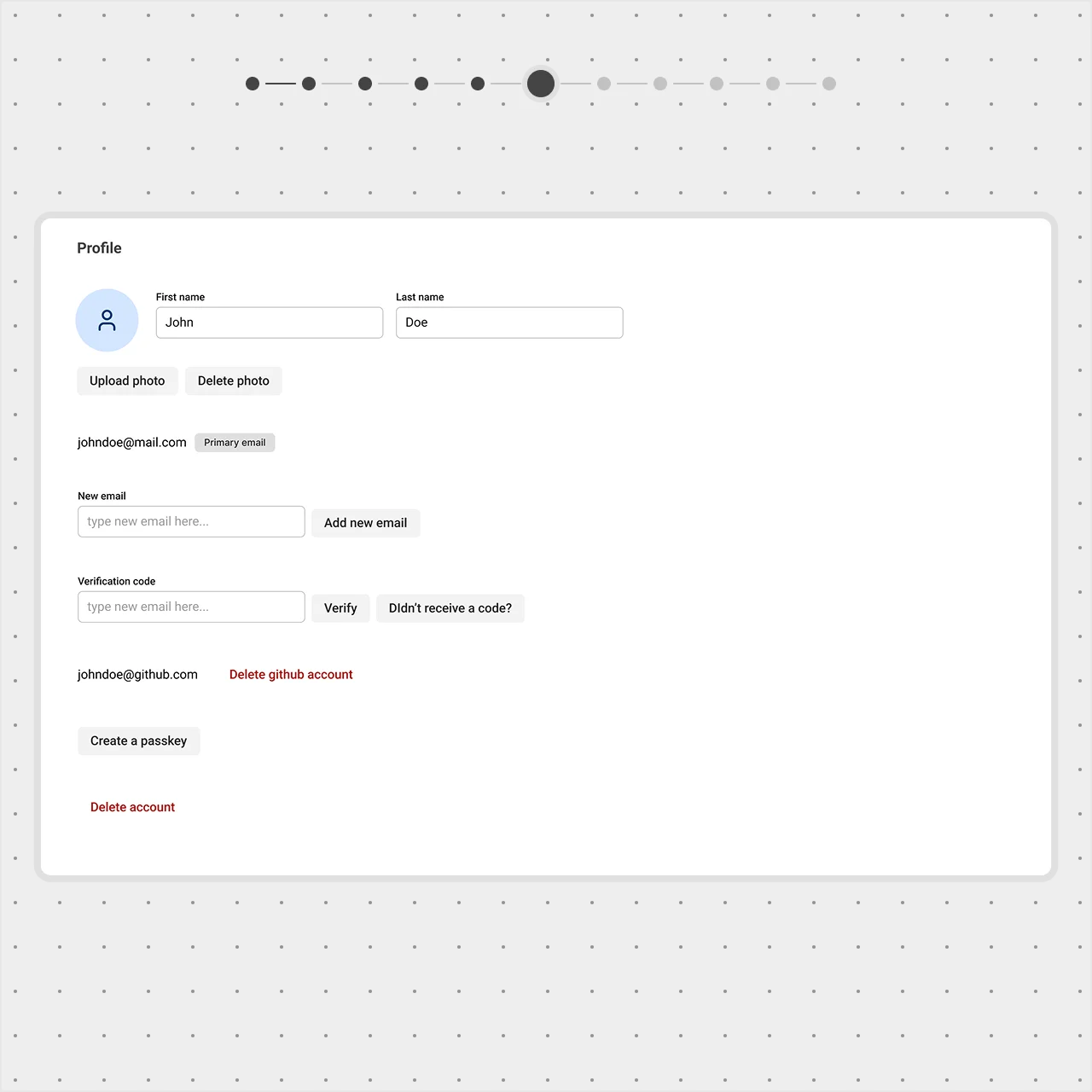
The Delete Photo button only appears when a photo has been uploaded, keeping it out of sight when it’s not relevant.

After label Before label A profile page with an avatar. The 'After' view displays a Delete Photo button only when a photo is uploaded, keeping the layout clean compared to the always-visible button in the 'Before' view.. A profile page with an avatar. The 'After' view shows an Upload Photo icon button appearing on hover over the avatar, simplifying the layout compared to the visible button in the 'Before' view.
The Delete Photo button was shown only when a photo is uploaded.
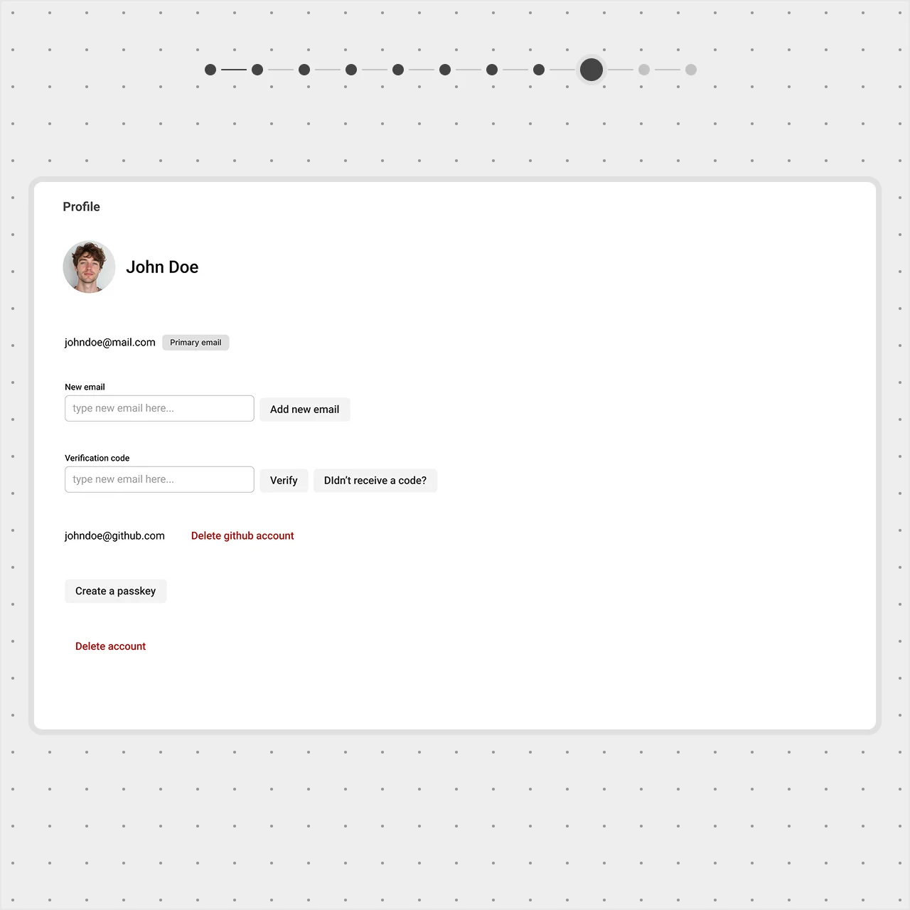
Reducing redundancy in name fields
  • The first and last name fields don’t need labels—users already understand their purpose;
  • We combined them into a single field and increased the font size to make the name more prominent;
  • A text cursor appears on hover, making it clear that the name is editable.
After label Before label A profile page with First and Last name fields. The 'After' view merges them into a single editable field with larger text and a hover cursor, removing labels for clarity compared to the 'Before' view.
A profile page with an avatar. The 'After' view displays a Delete Photo button only when a photo is uploaded, keeping the layout clean compared to the always-visible button in the 'Before' view..
The labels for First and Last name were dropped, and the fields were merged into one editable field with a larger font to stand out
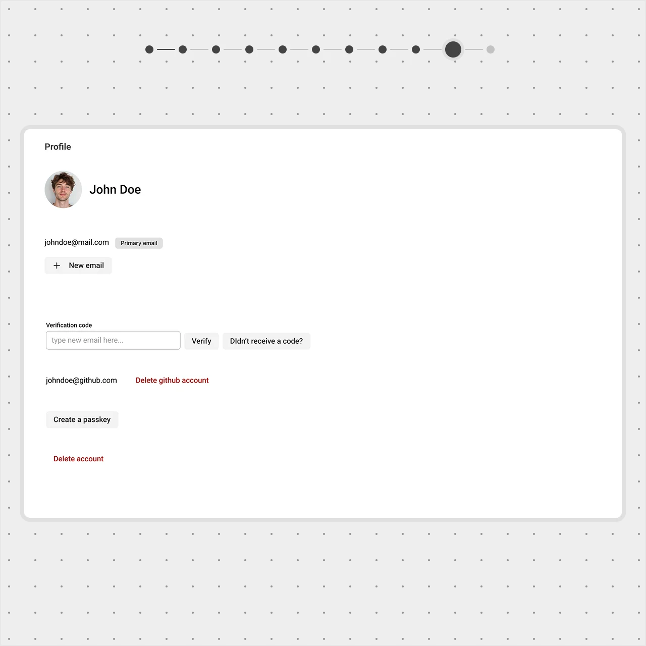
Streamlining email management
  • The New Email field stays hidden until the user clicks "Add new email" to keep the form compact;
  • The Add new email button was redesigned—"Add" was replaced with a "+" icon for a cleaner look;
  • We moved this button closer to the existing email, strengthening its connection to email management.

Pro tip: The brain processes images and icons faster than text, making them a great way to communicate at a glance.

After label Before label A profile page with an email section. The 'After' view hides the New Email field until a '+' icon is clicked, positioning it closer to the existing email for clarity compared to the 'Before' view.
A profile page with First and Last name fields. The 'After' view merges them into a single editable field with larger text and a hover cursor, removing labels for clarity compared to the 'Before' view.
The New Email field was hidden until the user clicks a '+' icon, replacing the Add New Email text to keep things tight, and it was moved closer to the existing email to make their connection obvious.
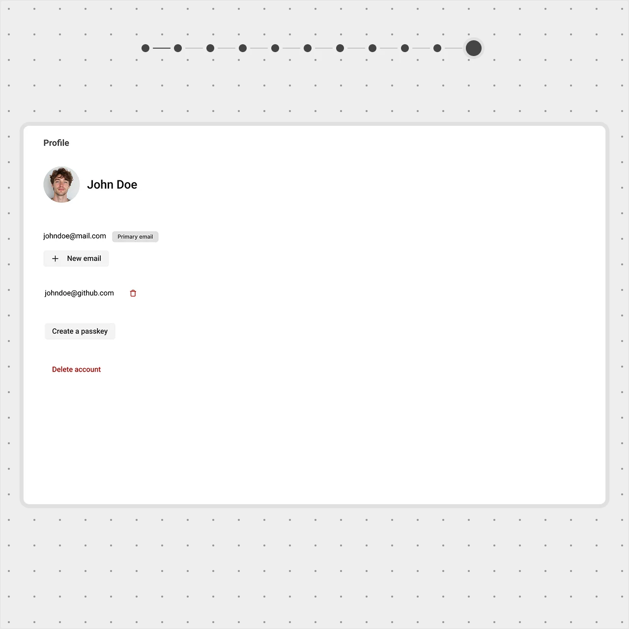
Removing unnecessary fields
  • The Verification Code field is hidden until it’s actually needed for email confirmation;
  • The Delete GitHub Account button was replaced with a trash can icon, a familiar pattern that keeps the UI clean;
  • A tooltip appears on hover, providing clarity without taking up space.

By revealing elements only when necessary, we keep the interface intuitive, focused, and free from distractions.

After label Before label  A profile page with email and account options. The 'After' view hides the Verification Code field until needed and replaces the Delete GitHub Account button with a trash can icon, simplifying the layout compared to the 'Before' view.
A profile page with an email section. The 'After' view hides the New Email field until a '+' icon is clicked, positioning it closer to the existing email for clarity compared to the 'Before' view.
The Verification Code field was kept hidden until needed for email confirmation, and the Delete GitHub Account button was swapped for a trash can icon

Conclusion

A well-structured UI isn’t about adding more—it’s about guiding users effortlessly. By applying visual hierarchy, we ensure key elements stand out while secondary details stay in the background. Grouping related elements improves clarity, while progressive disclosure keeps the interface clean and focused.

Each of these techniques works together to create a more intuitive, streamlined experience—one where users can find what they need without distraction or confusion.