Visual Hierarchy
Applying visual hierarchy principles make your UI intuitive, keeps users engaged, reduces friction, and boosts conversions.


Good design isn’t just about making things look nice — it’s about making sure users instantly know what matters most. Visual hierarchy is what guides the eye, separating primary content from secondary details.
In this lesson, we’ll break down the key elements of visual hierarchy, show how to manage them effectively, and explore how they shape the user experience.
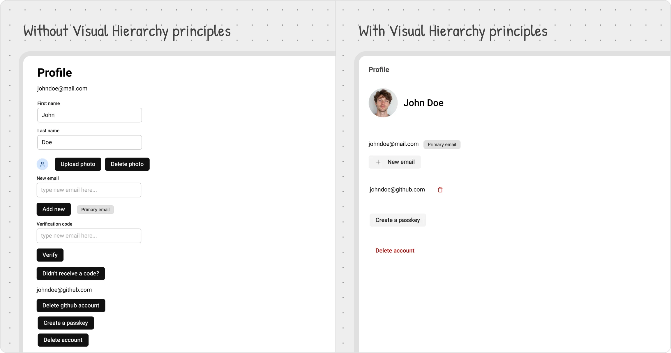
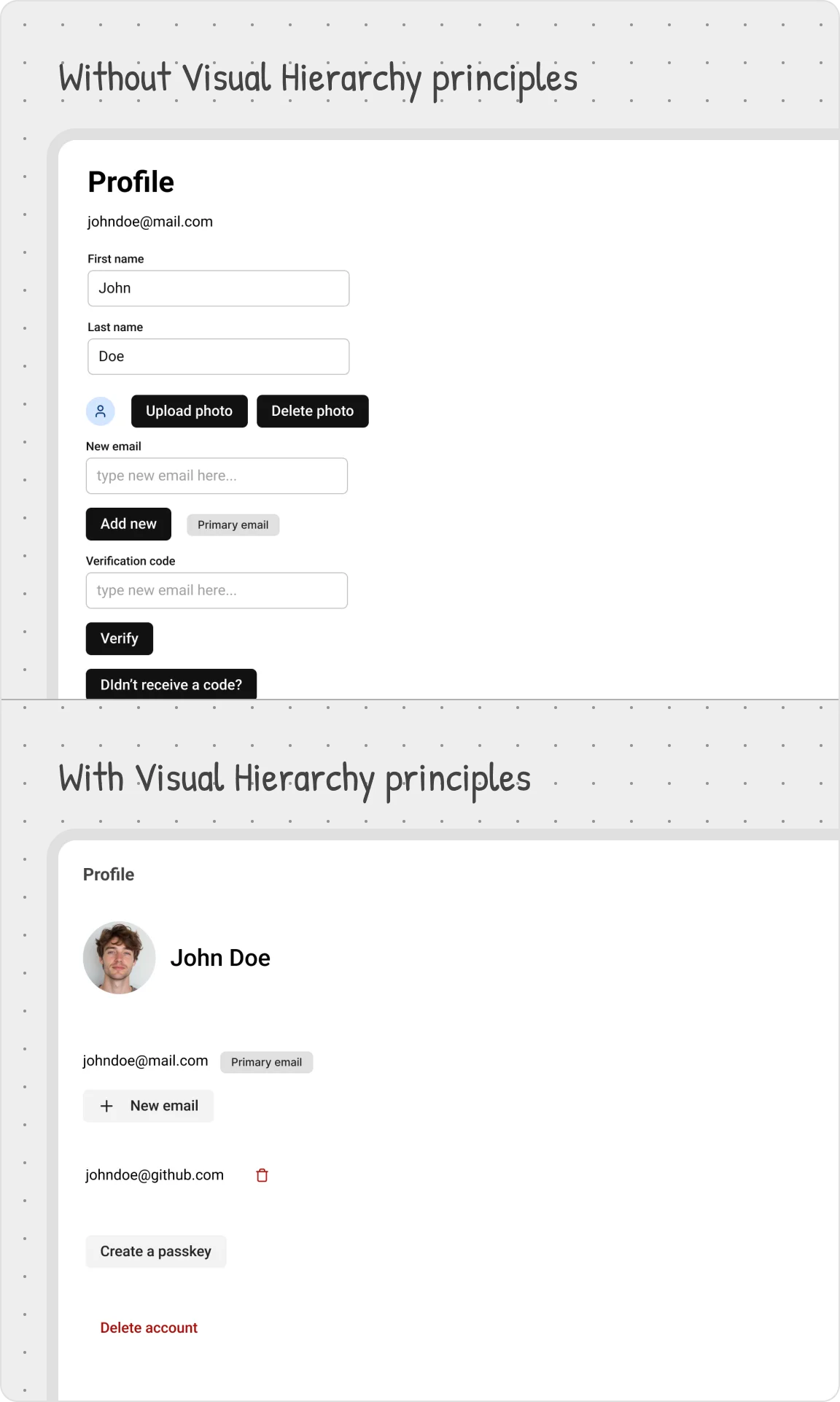
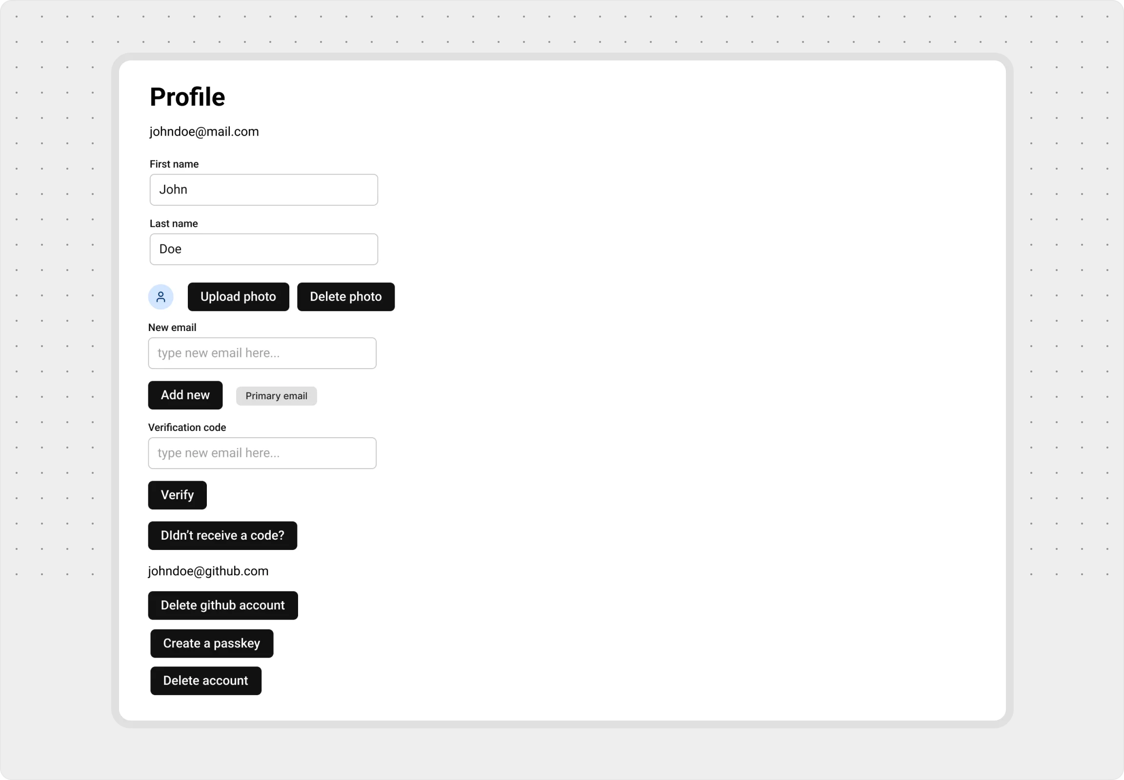
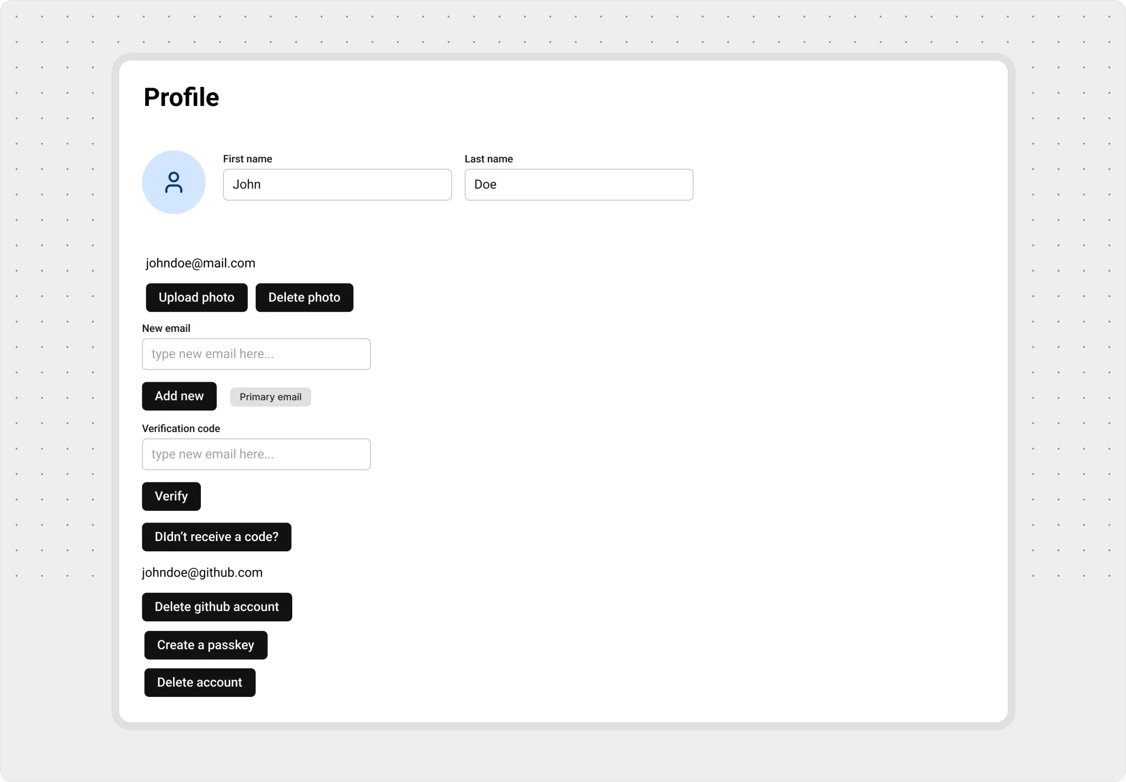
No Hierarchy: A Messy Start
Applying visual hierarchy principles make your UI intuitive, keeps users engaged, reduces friction, and boosts conversions.
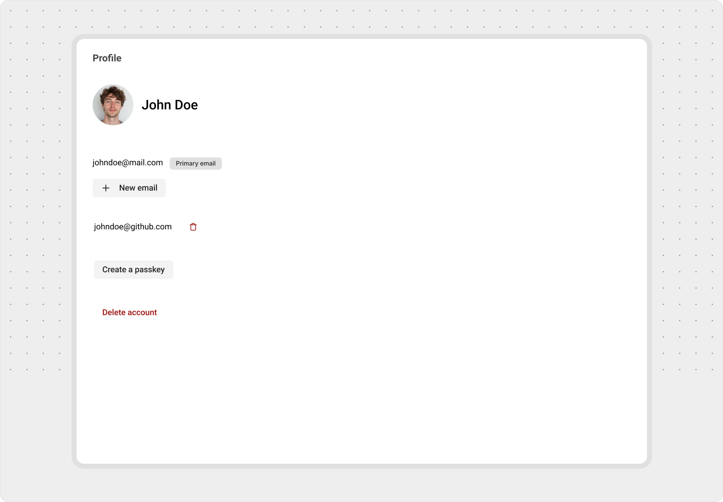
Establishing a Clear Focus
Learn how to guide users to the most important elements first, enhancing clarity and improving their overall experience.
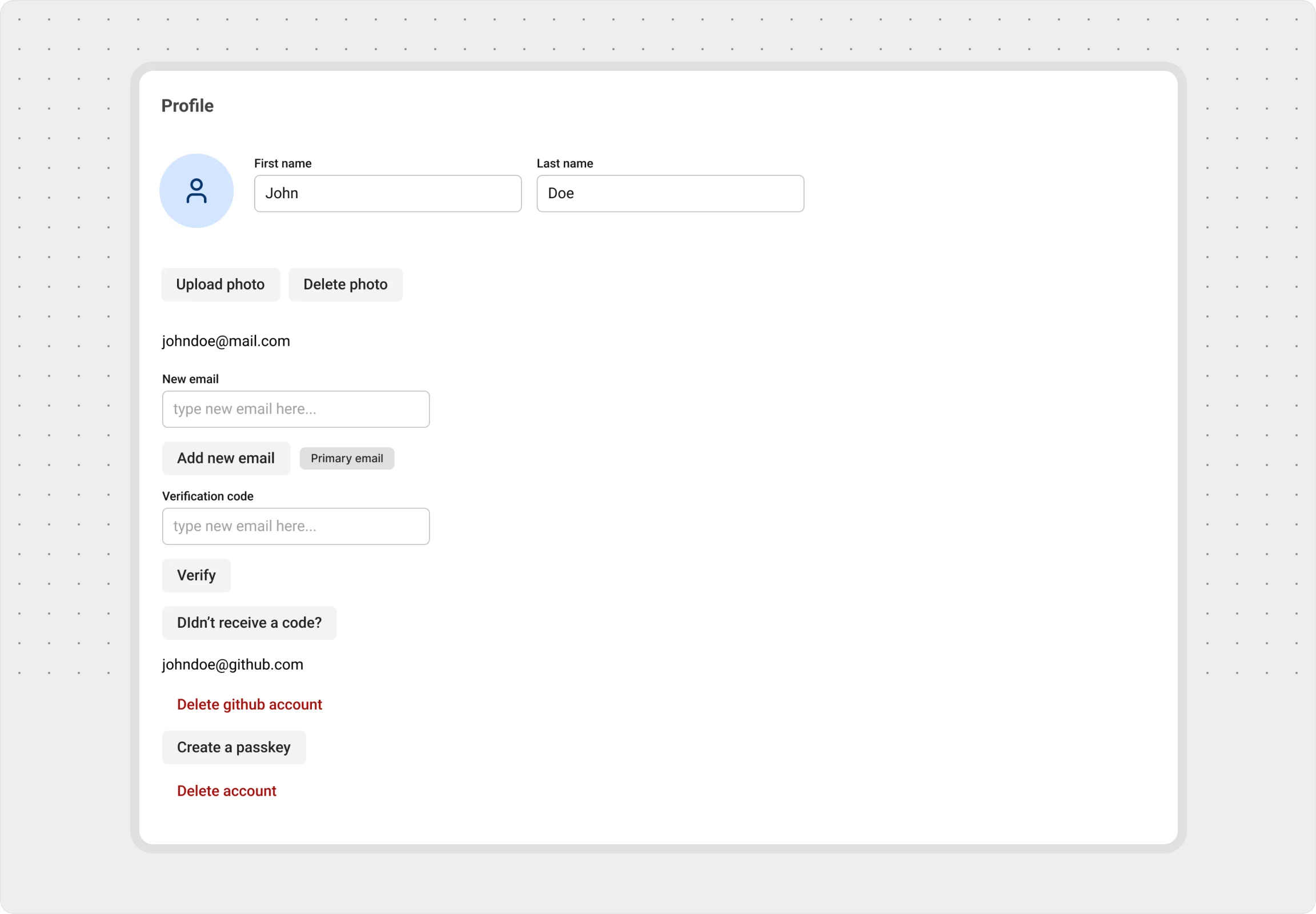
Emphasizing by De-emphasizing
Learn how to de-emphasize secondary and tertiary elements to allow primary elements to stand out while keeping the interface balanced, intuitive and clean.
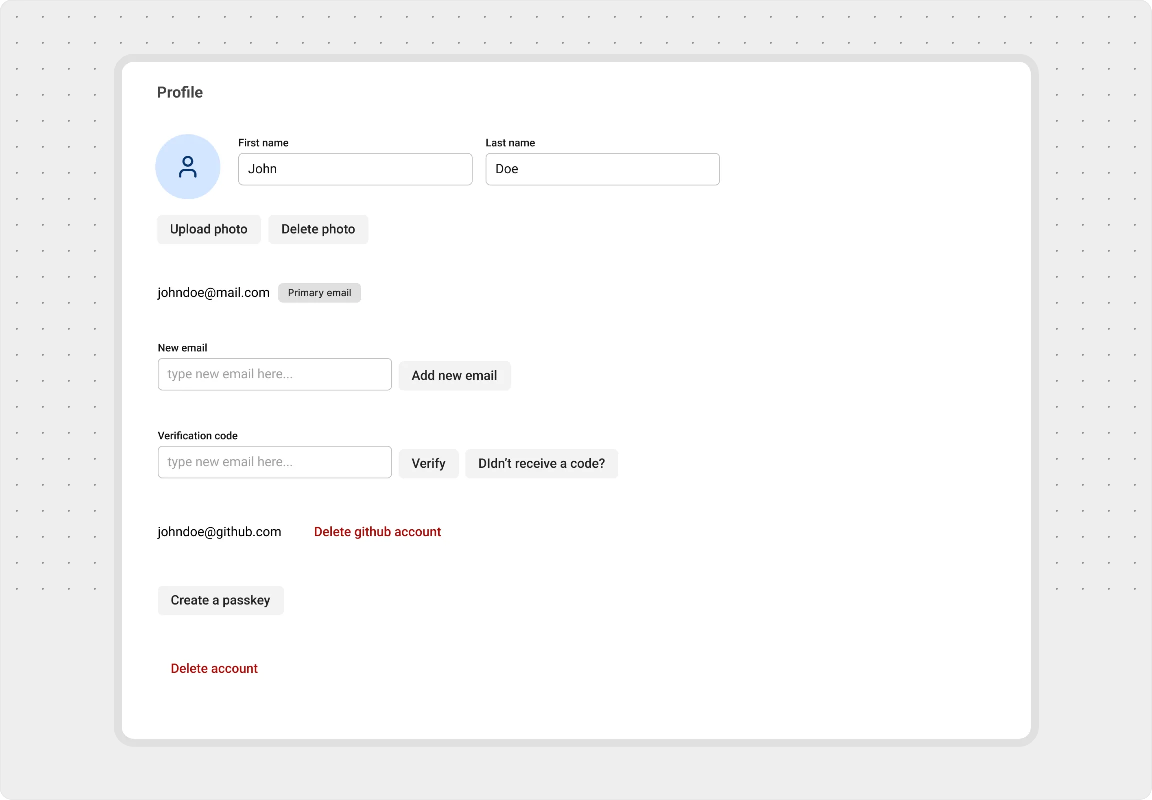
Grouping for Clarity
Learn how to group related elements together and uses spacing to create clear distinctions, making the interface easier to navigate and understand.
Progressive Disclosure
Learn how to reveal information step-by-step, keeping the interface uncluttered and ensuring users focus on what’s relevant at each moment.